Elettrotek specialises in consulting, designing, and implementing electrical, electronic, and industrial automation systems.
The brand pattern extends Elettrotek’s visual identity, using geometric shapes inspired by electrical circuits to convey precision and technical expertise. Its clean, repetitive design strengthens the brand’s professional image while ensuring versatility across print and digital platforms.
Application
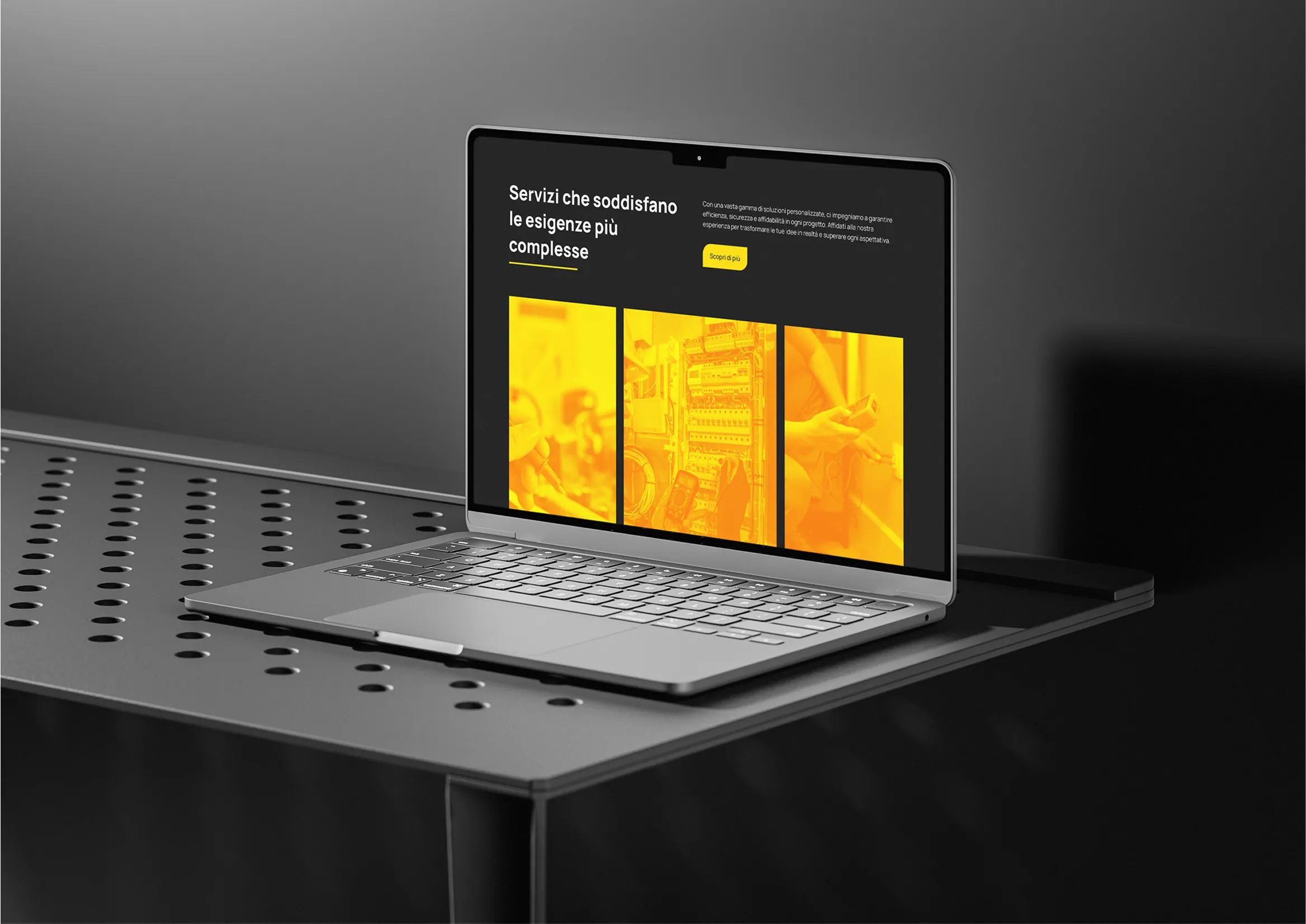
Elettrotek’s previous website lacked a strong identity, making it difficult to stand out. The redesign focused on creating a clear, professional digital presence that reflects their innovation and expertise.The minimalist design emphasises clarity, functionality, and consistency, integrating the new logo, pattern, and colour palette to deliver a cohesive and recognisable brand experience.
Results